7 Blog design tips: a guide for beginners

If you want to attract more visitors, create a great first impression, and increase engagement, then you must ensure your blog visually stands out. This involves fine-tuning its visual appeal, navigation, and usability. In this article, we’ve put together 7 effective design tips to help you create a well-designed blog.
Simplify navigation
Seamless navigation acts as the lifeblood of any great website. While there is no standard way of organizing and displaying information to users, bloggers should focus on making navigation across the website as simple as possible.
A good approach is to limit the number of items in the blog header or sidebar to five or at most, seven. If your blog features diverse content that spans a range of topics, you can consider creating a category menu for better content organization. All menu items should have a descriptive label or keyword so that visitors can easily find what they’re looking for.
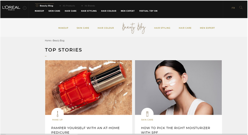
L’Oreal, a leading beauty brand, places its blog posts into different categories as shown below.

In practice, you should cherry-pick a couple of blog categories and place them on your webpage. It is also a good idea to de-clutter your top menu and include clear call-to-action.
Additionally, include some related post links at the end of your blog posts, or in your right sidebar so that users have a reason to keep reading your content.
Pick a consistent color scheme
When it comes to blog design, you have plenty of colors to choose from. Using a healthy dose of color on your blog or website draws your visitor’s attention.
A good idea would be sticking to two or three colors. When applying the colors, ensure they complement each other by placing light colors around solid colors. For instance, blue and white or red and white works great.
Worth a mention is that using too many colors becomes a distraction. It overwhelms the reader and disrupts the flow of messages in your posts. Bloggers should, therefore, choose a color scheme that is consistent across their brand and blog pages.
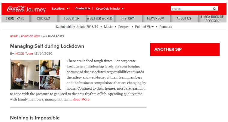
For instance, Coca-Cola’s distinctive color scheme is red, light grey, and white. They use the same colors on their website, with white in the background for better contrast and enhanced visibility.

Stick to 2-3 fonts
Just like the color scheme, it’s always good to limit yourself to two or three fonts when designing your blog.
Ideally, you can have one for your headlines, another for your body text, and a third font for your sidebar titles. Using too many fonts makes your blog page look messy, unprofessional, and unreadable. When choosing fonts, aim for those that are professional, legible and of an appropriate size.
Use a simple layout
A general rule of thumb when it comes to web design is keeping everything super-simple. This means removing anything that might get in the way of visitors.
For instance, you should avoid layering way too many elements into a blog page. Studies have shown that human short-term memory can only hold up to seven items. This concept also applies to blog design- that you should always limit your menu or other visual features on the user interface to seven items. Websites with a simple layout look better, feel better, work better, and are more usable compared to those with a complicated design.
Leave breathing space (or white space)
White space, also known as negative space or breathing space, is an indispensable aesthetic element of web design. When used properly, white space helps bloggers communicate their ideas more clearly. It gives readers room to relax when interacting with content on your blog. This increases comprehension and can improve your conversion rate significantly.
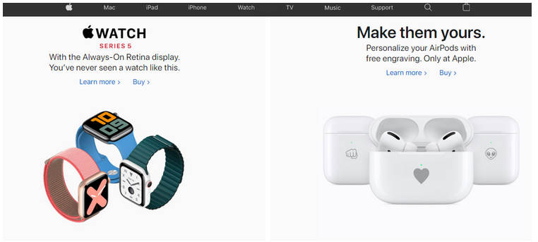
Another reason for leaving whitespace is that it makes your pages feel less crowded, more organized, and more legible. You can incorporate whitespace on your blog by adding some margins and padding between different sections or elements of your blog. Take a look at how Apple uses whitespace to draw more attention to their products.

Make it visually-appealing
Bloggers should capitalize on enhancing the visual appeal of their websites. This involves tweaking every element that meets the eye, including pictures, colors, fonts, heading sizes, shapes, buttons, white space, and more to strike a visual balance.
Website visitors spend a significant amount of time viewing or interacting with the website logo, navigation menu, search box, featured images, and bottom of your blog. Ensuring these elements look great can help you create a good first impression, which leads to a longer on-site duration.
Ensure a mobile responsive design
With the increased use of mobile devices such as smartphones and tablets over the last few years, bloggers who ensure a responsive design are bound to enjoy more success.
According to Statista, 52% of website traffic comes from mobile devices, which means most users on the web use mobile. Additionally, Google implemented mobile-first indexing, which means blogs and websites that optimize for mobile are more likely to rank higher. For this reason, bloggers and other internet marketers should make their websites mobile-friendly by implementing a responsive design. Otherwise, you might be leaving so much on the table if you’re not optimizing for mobile.
Conclusion

A functional and visually appealing design is essential when it comes to creating a great first impression, building a lasting relationship with visitors, and maintaining your brand image. It serves as a foundation for building an exceptional user experience.
Luckily, ensuring a great web design does not mean transforming your blog into an artful masterpiece. It’s all about making different elements of your blog findable, usable, and accessible by your audience.
In a nutshell, following these tips above will go a long way to improving your blog. When visitors find your blog appealing, there’s a good chance that they will spend more time interacting with your content. Subsequently, a longer stay on your website increases the chances of conversion.
--
Adela Belin is a content marketer and blogger at Writers Per Hour. She is passionate about sharing stories to make a difference in people's lives and contribute to their personal and professional growth. Find her on Twitter and LinkedIn.