Build the ultimate website to promote your app or project

Showcasing your app on your website can help you reach potential users worldwide. A website enables you to present your app independently, giving you creative reign over your marketing and audiences. Launch your website on a short and memorable domain, and it becomes easy to share through social media, email, and word of mouth.
We’ll show you 7 essential features to consider in order to get the most out of your app’s promotional website and explore seven app websites that offer stellar examples of these features that you can use to market your own app or project.

1. Give an elevator pitch of your app or project
A key step to marketing your app is to succinctly tell users exactly what it does. This important information should be quick to read and front and center on your website. Make it easy to understand the purpose of your app by using short sentences designed with high visibility.
This strategy helps visitors decide immediately what they want to do next. By providing simple information from the start, you can lead website visitors down the path to the next steps you want them to take. To see how this tip works in practice, look to UseMy.xyz.
UseMy.xyz is an app where users can lend everyday items to others or find and borrow an item they need. Their homepage features a two-sentence elevator pitch of the benefits to users, along with a quick description of what the app does. UseMy.xyz includes a prominent button with a call to action (CTA) to download the app, located immediately under this description.
Their strategy is to tell users what their app does via the elevator pitch, then make it easy to get to the app with a simple click. In less than 30 seconds, UseMy.xyz gives future users what they need to know to get started.
Try this strategy on your homepage to quickly relay information that new users need about your app and encourage app downloads.

2. Include a clear call to action for downloading your app
Crafting a promotional website for your app can help generate downloads and add new users. It’s essential that you make download links clear and highlight them so that they are one of the most important elements on the page.
A call to action (or CTA) is an element of your website that tells your audience what to do. Websites most often will utilize a highly visible button with action text, that makes it easy for the user to see and click right off the bat. An example of a solid CTA layout can be found on POAP.xyz’s website.
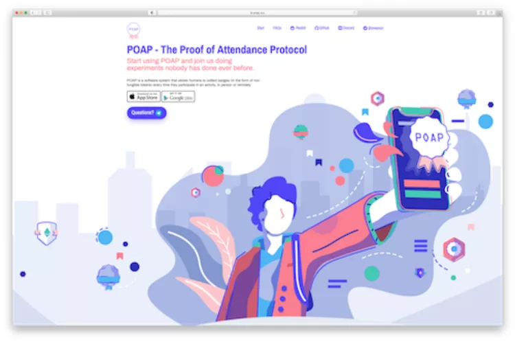
POAP.xyz is an app that uses decentralized technology to create a system where users can collect badges to confirm their participation in activities at events. POAP.xyz’s homepage is colourful and simple, and right in the centre of the screen they feature a small group of calls to action.
POAP.xyz uses the brands of Apple App Store and Google Play in their CTA buttons to show users where the app is available. A third button calls out “Questions?” which leads users directly into messaging with their team.
Try placing prominent marketplace-specific buttons on your website to immediately signal where potential users can get your app and help increase download conversions.
3. Show the devices your app works on
A significant number of apps today are compatible with more than one device. New users will want to know which of their devices work with your app before they try it.
Showing them what your app is compatible with gives them a visual of your app at work, making it real in their mind. This also answers one of the first questions users will have – how to use your app. A company that answers this question in an engaging manner is Fill.xyz.
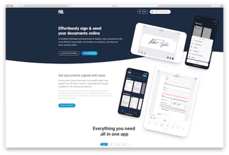
Fill.xyz is an app designed to help users e-sign documents on their mobile devices. Fill.xyz‘s website homepage shows right away that their app works on both mobile phones and tablets by featuring images of the app in use on these devices. This visual cue gives users a clear understanding of how the app works and where, before they even read a word on the website.
Try this method to give your website viewers a strong visual that will stick in their minds, make it real, and show where your app can be used.
4. Use images to illustrate key features of your app
Your elevator pitch and images of compatible devices help viewers create a solid understanding of your app. To showcase the full range of benefits of your app, you can present a magnified version of each feature on your website.
Use short, easy-to-read sentences that explain important individual features and their benefits. Share close-up images of these features next to the descriptions so users will know how to use your app as soon as they open it. A great example of this strategy is Mee6.xyz‘s website.
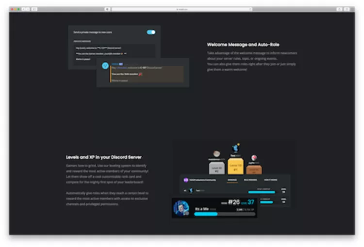
Mee6.xyz is a bot made to integrate into the messaging platform Discord and gives users more control over their community. Mee6.xyz allows users to add custom commands and roles for members, or gain ranking based on activity related to the community.
These services can be difficult to picture, so Mee6.xyz features screenshots of each one as they would look in use on a Discord server. These visuals help explain, showing potential users how the features work, and also make it easy to visualize the benefits.
Help users grasp the benefits and get them thinking about the ways your app can solve their problems by illustrating your app’s features.
5. Share testimonials from users to add social proof
There is an overwhelming amount of apps available today. Generating trust in your app is important if you want folks to try it out. One of the strongest ways to earn that trust is by showing your app has “social proof” of its legitimacy and benefits.
While app platforms already provide reviews, you can use your website to highlight the best reviews from your users, and also feature testimonials posted on other mediums. These could be social media posts, quotes, or even videos of users talking about why they like your app. GitHistory.xyz can help provide some inspiration for trying this tip.
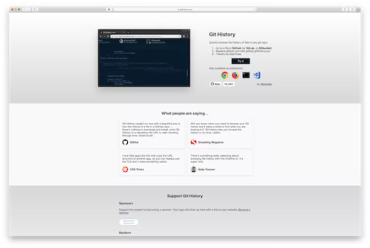
GitHistory.xyz is a browser application that enhances a key feature of Github, a popular platform amongst the developer community for code collaboration and version control. GitHistory.xyz’s website proves the app’s popularity and legitimacy by listing testimonials from well-known members of their target audience in a section on their website titled “What people are saying…” This adds social proof and shows the app is popular with makers and developers, which are GitHistory.xyz’s ideal user base.
Try this tip on your website to increase trust with new users and help increase downloads of your app from your target audience.
6. Demonstrate potential use cases for your app
The tips so far have focused on how you can use your app’s website to tell your audience what your app is and show off its features and benefits. This next tip will show you a great way to set your users up for success by breaking down scenarios that users can relate to. Users will be able to anticipate the benefits of your app before they’ve even downloaded it.
Sharing potential uses and scenarios can be especially helpful if your app solves complex problems. A model to look toward following on this tip is Mailchain.xyz.
Mailchain.xyz is a blockchain-based, email-like messaging service designed to allow users to send and receive messages between addresses and accounts. Blockchain technology is highly popular and growing fast, but many people are just becoming aware of its benefits and uses.
Mailchain.xyz shows how businesses, communities, and cryptocurrency owners alike could use this messaging service in the “Use Cases” section of their website. They list three different examples for each scenario, showing how users in various roles could use the service. This helps users try Mailchain.xyz with a clear goal in mind as they start.
Pitching your app can be more effective when you show potential users clear ways to get started. Try this tip to make a great first impression and guide your users to a successful first experience with your app.
7. Provide a video or demo to give users a trial experience
New users often want to see your app in action before they try it themselves. Seeing how it works helps them feel more comfortable by trying before buying (or downloading.) Get inspiration for your website by seeing an example of how this is done, and also preview a useful tool that will help you do it yourself on Overframe.xyz.
Overframe.xyz is a recording service that helps users make demo videos of their app in use. Overframe.xyz knows the value of adding app demo videos to your website, because their app is a tool that creates demo videos! On their own website homepage, they feature a gif of the Overframe.xyz tool in use, showing the user interface of the app.
They include a secondary call to action right next to their “Get it now” button, and an option to watch a demo. Clicking on the “Watch demo” button pops up a video that shows how a user can use their app to record their own app demo. This video helps potential users get a quick idea of the quality and ease of use of Overframe.xyz’s tool.
Try giving your audience a look at your app in action so they can know what to expect from the user experience. They’ll be able to see the benefits your app offers firsthand, and go into using it with more trust.
Conclusion
When it comes to making the ultimate website to promote your app, focus on making information easy to find and process. Give your visitors a quick pitch of your app, use clear download CTAs, and give social proof that others like your app to help turn website visitors into app users. Visualize the features and benefits of your app, offer videos or demos, and share the devices it works on to start users off on the right foot. Provide potential use cases to help your site visitors get a clear picture of how they will use your app, as well.
Following the example of the seven .xyz websites above can help you make your app’s promotional website as effective as possible for generating users.
In collaboration with Team XYZ
.GROUP extension: unity for brands and communities
Digital allyship: how businesses can support LGBTQ communities
Related articles:
