The Art of Effective Web Design for Conversions

Irrespective of the industry your business operates in, the primary goal of your website likely revolves around turning visitors into clients. The key to achieving this lies in strong website design and gaining their trust. Explore these fundamental approaches to enhance your website's credibility, thus ensuring a higher rate of successful conversions.
Introduction
In an ever changing world, the internet has gone beyond being a space for entertainment. People have become more particular over time. A plain-looking website won't impress anyone. So, a well designed website has become the order of the day. Every business with a website wants to catch people's attention and turn them into customers or subscribers. Design is a big deal for this.
Good web design doesn't just make websites look nice; it also helps turn visitors into customers or subscribers. We can't ignore how helpful it is. A user-friendly layout, easy navigation, and attractive visuals makes your brand and product more attractive. Not to forget credible too. A bad website can have serious consequences on your conversions and brand appeal.
The link behind good design and user experience
The connection between website design and user experience is quite significant, and it's essential to grasp how they relate to each other. The design of a website can have a big impact on how users feel when they visit the site. A good design can give users a pleasant, easy experience, which keeps them engaged and more likely to do what you want them to do. On the flip side, a poorly designed website can lead to frustration, confusion, and a lot of people leaving without doing anything.
So, when it comes to designing a website, the main goal should always be to create a positive user experience. This means making sure the site is easy to use, looks nice, and works well on different devices. A well-designed site for user experience will have a neat layout, clear ways to get around, and well-placed buttons or links to guide users. It will also load quickly, so people don't have to wait.
Accessibility is another crucial part of the user experience. A website that's accessible to people with disabilities not only makes the internet more inclusive but also makes the experience better for everyone. This involves making sure the website is easy to use with just a keyboard, providing descriptions for images, and using simple and clear language.
In summary, the link between website design and user experience is very important. A website that's well-designed with user experience in mind can boost engagement, increase the chances of people taking action, and ultimately lead to more success for your brand.
Tips on how to create a conversion boosting website
Set Clear Goals for Each Page
Each page on your website should have a specific purpose that aligns with what your visitors are looking for. Whether it's a small or big action, you should know what you want that page to achieve, and every element on that page should contribute to that goal.
Focus on A/B Testing
Not all websites can follow a one-size-fits-all approach when it comes to design. What works as a design trend or tip for one website or business might not be as effective for another. Take, for instance, the web design for a coworking space business; it's likely to be quite distinct from that of an IT consultancy firm, even though both operate within the tech industry. If you plan to incorporate any of the current design trends, it's essential to monitor their impact.
Every design element plays a role in influencing your website's conversion rates. If a recent change doesn't seem to be boosting sales, it's crucial to assess its effects and consider swapping it out for another option that may be more captivating and beneficial. To facilitate this process, you can utilise Figma iPhone mockups to test the design on both mobile and web platforms and make an informed choice with your team.
By modifying or replacing features, you'll create two distinct scenarios to analyse. Comparing these scenarios will help you determine which one adds more value to your website.
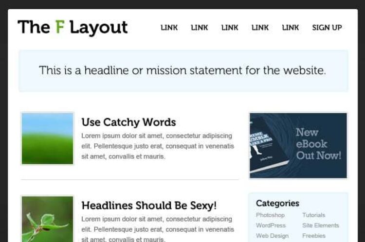
Incorporate F-Shaped content design
Understanding user behaviour can be a challenging task. It necessitates in-depth research and careful observation of how individuals read and navigate web pages. Insights from eye-tracking studies reveal diverse reading patterns, one of which is the F-shaped pattern. This pattern suggests that users tend to scan a webpage in a horizontal manner initially, and then progress in a vertical line. In other words, they start by perusing headings and subheadings before delving into the main content. The F-shaped design is a crucial concept to adhere to, as it underscores the pivotal areas that capture user attention.

Source Envato
Keep a Consistent Focus
Every element on your page, be it images, layout, words, or buttons, should support that main goal. The same principle goes for your entire website; it should work towards a common objective.
Avoid Overwhelming Choices
Offering too many options can confuse and discourage your visitors. Instead, use design, layout, and clear calls to action to gently guide your audience toward the desired action, taking into account who your target audience is and why they're there.
Embrace White Space
White space, which doesn't necessarily have to be white, is vital for keeping your visitors focused on what matters most on your page. It prevents them from feeling overwhelmed by too much information.
Craft Effective Calls to Action (CTAs)
A well-crafted CTA clearly tells your visitors what you want them to do. Design, placement, and action-oriented language all play a role in grabbing their attention. Use buttons, colours, and directional cues like arrows to make your CTAs stand out, and don't forget to test different designs to find what works best.
Maintain a Consistent Style
Your website's design should always make it obvious that the visitor is on your site. This visual consistency builds trust with your audience, so avoid abrupt changes that could erode that trust.
Guide Your Visitors
You don't need to be pushy to have a high-converting website. Instead, gently guide your visitors to explore further by organising information effectively. Balance information with visually appealing elements to make your site feel comfortable and inviting.
Highlight Your Benefits Clearly
People can quickly grasp a visual concept, so use a striking "HERO" image to convey the main benefit of your offering. Keep it simple and focused, whether it's a photo, illustration, or video.
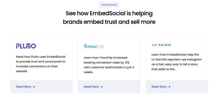
Show social proof
Establishing credibility is a key factor in drawing more users to your website and turning them into customers. A powerful way to gain trust is by using social proof, which can take the form of showcasing endorsements from experts, displaying certifications, leveraging celebrity endorsements, or highlighting customer reviews and social media interactions. As Hubspot notes, "88% of consumers trust user reviews as much as personal recommendations." This statistic underscores the significance of using various methods to demonstrate your brand's popularity or provide insights into the standing of your products.
One effective strategy is to gather reviews from satisfied customers and share them with potential new users. By doing so, you can significantly enhance your sales and increase your conversion rates.

Source Embed Social
Simplify Forms
While you want to gather relevant information, too many form fields can discourage users from completing them. Stick to essential questions and think about what you can collect later. Align forms with their purpose for a smoother experience.
Prioritise the User's Perspective
Put yourself in your visitor's shoes and think about what they expect. Would you stay on a site with slow loading times? Use this insight to create a fast, user-friendly, mobile-responsive website that meets your visitor's expectations.
Collect and Analyse Data
To improve your website's conversion rates, use data to uncover any hidden barriers and track how changes impact your results. Remember, out-of-the-box website design platforms may not offer this level of customisation and optimisation.
Conclusion
When you start looking into the best ways to optimise your brand's website design - it's crucial to focus on the ones that are most pertinent to your objectives and tackle them methodically, one by one. One effective starting point is to enhance the user experience. Dive into the unique buyer's journey of your website and address any sources of discomfort or uneasiness. Implement a mobile-responsive design to guarantee that your site looks and functions well on mobile devices. This post has already highlighted some valuable tips. Prior to adopting additional methods, take the time to analyse your business and understand the specific needs of your consumers.
